CD Cover Analysis
Adele
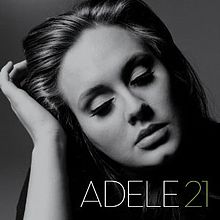

The font on the cover of Adele’s 21 album is clear and capitalised. It keeps in theme with the picture of black and white and is clearly visible against the dark back round. The font itself is fairly straight forward, with plain letters but written in a large font, drawing in the focus of viewers. Interestingly the name of her album includes her first name, and the age she was at the time of production. This gives us a few ideas in terms of stylistic features such as font and album names, and we will bear this in mind when creating our own cover.
The picture takes up almost the entire front cover of the album and is represented in black and white. The image itself is a close up of Adele looking down and slightly upset, which could cause possible buyers to wonder why she was upset and want to buy the album in order to find out. This style of album cover is not dissimilar to that of Tracey Chapman and Duffy’s, both of whose picture is also looking down with a sad expression. There are identifiable features present in all the artists pictures, such as a focus on the lips. This could be linked with Laura Mulvey’s male gaze theory as the lips could be thought of as sexualised and reminding male viewers of a vagina. Furthermore, Adele is not wearing any noticeable make up, going for a more natural look. This could be interpreted as rebelling against a society where women are seen as ‘ugly’ or that they don’t care about their appearance. Adele is creating her own brand image, encouraging people to be their selves and in doing so, making her a lot more relatable to her audience.
The lighting of the CD cover is fairly dark and obviously altered in order to match the black and white theme. Her lips and eyes are particularly dark, whilst the rest of her face remains in the light and quite bright. Her hair looks very dark in comparison with her arm, which again is very pale and bright. This could be to put a focus on the fact that she is touching her hair, a typically nervous trait which would cause the audience to question what was making her nervous.
The back of the album cover is similar to the front in terms of characteristics of the photo and stylisation of the font. The image again focuses on the lips, but Adele is looking straight into the camera, using mode of address by connecting with the audience, as opposed to looking down on the front cover. The front of her face is bright as opposed her neck and hair and the fact that she is not smiling or looking upset creates a mysterious element to her personality, making her more interesting in general and therefore more likely that people would buy the album. The font is again white and capitalised, making it very clear against the dark back round, and still keeping relevant to the theme of black and white.
The brand image of Adele is therefore identifiable with her consistent themes throughout the album covers. This means that every time the viewers see something black and white, or a picture with a strong sense of sensitivity, unconsciously they think of Adele. This makes her as an artist more relatable and referable to her audience and could increase her demographic as her sales extend beyond her niche market, because she has become a symbol. With a society which refers to any black and white theme to Adele, through the uses and gratification theory, people want to feel included with the ‘craze’ Adele, and therefore buy her album for a sense of inclusion.
Gabriella Cilmi
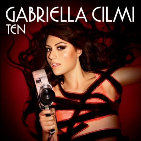
The font on the front cover of Gabriella Cilmi’s album is interestingly like Adele’s, white and capitalised. This seems to be a common theme amongst CD covers of soul female singers, and could be used in my own album cover. It is written across the top of the album, taking no attention away from the image, in a slightly bold font. This could be a representation of the bold, out-going, almost boisterous elements of Gabrielle cilmi’s personality, with indications of a playful side to the singer, making her more sexually appealing for males. Her name is bigger than the album name, promoting her as a person in terms of brand image rather than the actual sales of her album. Because of the positioning of the font, her name is then the first thing we read, making us more likely to remember her and once again promoting her overall image.
The image on the front has various connotations all based around Laura Mulvey’s male gaze, and other features which objectify her and encourage male buyers. This shown firstly with the way she is holding the old fashioned camera, which is her phallic symbol. Her grasp on the handle of the camera reminds male viewers of the grasping of a phallus. Furthermore, her lips are partly opened, directed towards the camera, extending the sexual connotation once more. In addition, the film of the camera is wrapped round her, which could have various layers of meaning. For example, this could be a portrayal of men and society that males continue to hold the dominance over women, and the idea of a patriarchal society. However, you could also interpret the film around her as her being in control, a common sexual fantasy, as she is slightly smiling and holding the camera, insinuating that she is ‘calling the shots’ in this scenario. Other factors which contain sexual connotations are the wildness of her hair and a lot of skin showing. Both these factors remind males of sexual intercourse, making them more interested in buying the product. Finally the colour red has various common connotations such as sex and danger, both of which once again appeals to the male audiences and increases the sexual nature of the image.
The lighting on the picture is fairly dark round the edges, with a her body being spot-lighted, giving it an immediate focus and enabling the audience to notice her first. Again it puts an emphasis on her skin, which contributes to help reminding male viewers of sex, and objectifying Gabriella Cilmi as a sex symbol as well as an artist. The darkness around her also adds to the effect of mystery, and causes viewers to ask where she is and what is around her.
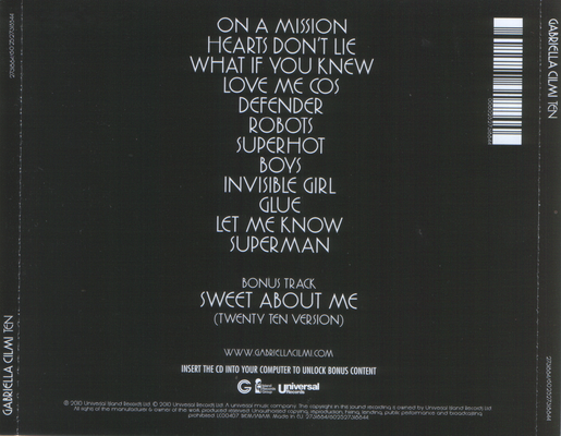
The back cover of the album is simply black, with the text of the songs in white written down the centre of the case. It is interesting that they haven't included any other special effects such as pictures or patterns. This could be because the front cover is very explicit in what it is trying to portray and they don't need to put across any other connotations, feelings or emotions to continue the general idea. This could be linked in with the theme, as mystery and darkness are recurrent ideas involved in the CD cover, and a plainer back round subtly continues this theme without taking the focus away from the main picture on the front. Furthermore, This could then be related to the brand image of Gabriella Cilmi, as she is portrayed as a sex symbol and objectified. In addition to this, she is also then remembered as a sexual fantasy for men, with an element of mystery involved with her character. Her CD cover image is not dissimilar to Madonna's 'voices' album cover, which involves her in a strappy outfit showing a lot of skin with a dark and mysterious back round. Madonna is a lot more 'naked' in hers, but it seems Gabriella has attempted the same 'wow factor' in terms of sexual nature, the only difference being she has included herself holding the Phallic symbol.
The image on the front has various connotations all based around Laura Mulvey’s male gaze, and other features which objectify her and encourage male buyers. This shown firstly with the way she is holding the old fashioned camera, which is her phallic symbol. Her grasp on the handle of the camera reminds male viewers of the grasping of a phallus. Furthermore, her lips are partly opened, directed towards the camera, extending the sexual connotation once more. In addition, the film of the camera is wrapped round her, which could have various layers of meaning. For example, this could be a portrayal of men and society that males continue to hold the dominance over women, and the idea of a patriarchal society. However, you could also interpret the film around her as her being in control, a common sexual fantasy, as she is slightly smiling and holding the camera, insinuating that she is ‘calling the shots’ in this scenario. Other factors which contain sexual connotations are the wildness of her hair and a lot of skin showing. Both these factors remind males of sexual intercourse, making them more interested in buying the product. Finally the colour red has various common connotations such as sex and danger, both of which once again appeals to the male audiences and increases the sexual nature of the image.
The lighting on the picture is fairly dark round the edges, with a her body being spot-lighted, giving it an immediate focus and enabling the audience to notice her first. Again it puts an emphasis on her skin, which contributes to help reminding male viewers of sex, and objectifying Gabriella Cilmi as a sex symbol as well as an artist. The darkness around her also adds to the effect of mystery, and causes viewers to ask where she is and what is around her.
The back cover of the album is simply black, with the text of the songs in white written down the centre of the case. It is interesting that they haven't included any other special effects such as pictures or patterns. This could be because the front cover is very explicit in what it is trying to portray and they don't need to put across any other connotations, feelings or emotions to continue the general idea. This could be linked in with the theme, as mystery and darkness are recurrent ideas involved in the CD cover, and a plainer back round subtly continues this theme without taking the focus away from the main picture on the front. Furthermore, This could then be related to the brand image of Gabriella Cilmi, as she is portrayed as a sex symbol and objectified. In addition to this, she is also then remembered as a sexual fantasy for men, with an element of mystery involved with her character. Her CD cover image is not dissimilar to Madonna's 'voices' album cover, which involves her in a strappy outfit showing a lot of skin with a dark and mysterious back round. Madonna is a lot more 'naked' in hers, but it seems Gabriella has attempted the same 'wow factor' in terms of sexual nature, the only difference being she has included herself holding the Phallic symbol.
Kelly Clarkson
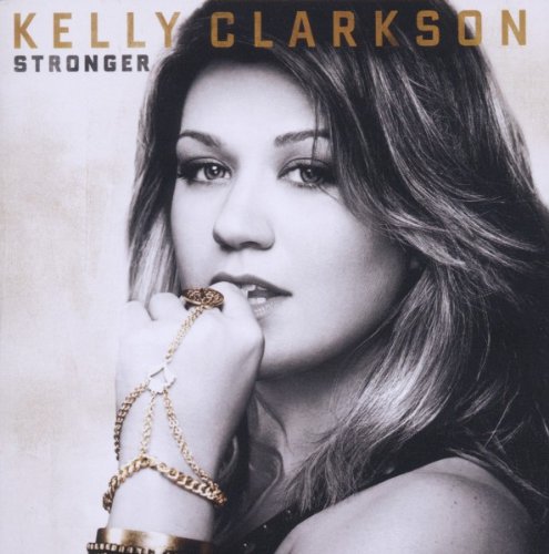
The font on the front cover of Kelly Clarkson's album 'stronger' is gold and yet again capitalised, written across the top of the CD cover. This could be because when a CD is put on shelves in a shop, the only bit possible viewers see is that certain strip, which would make people more likely to purchase and bring the attention straight to herself which then promotes her as an artist. After analysing three albums, all of which capitalised the name, it would seem sensible to do my own writing in the same style. She has also put her name above and in a bigger font than the name of the album. This shows the primary reason for the album is to promote Kelly Clarkson as an artist rather than her album itself.
The image on the front cover of the album is a close up Kelly Clarkson's face in black and white with a chain wrapped round her hand and her hand slightly in her mouth. There are various factors inside this image which could be related to various theories such as Laura Mulvey and Andrew Goodwin's theory. Firstly, she seems to be wearing a strap or vest top and is therefore showing a lot of shoulder. This would lead to male viewers thinking she was wearing virtually nothing, and being more interested because it reminds them of sex. Secondly, the way she is nibbling on a golden chain could also be related to her being objectified. This attracts attention to her slightly parted lips and her biting the chain in a somewhat playful manner yet again reminds viewers of sex and would cause them to fantasize about Kelly Clarkson meaning that yet again, she is promoting herself as an artist. Furthermore, the image could relate to Andrew Goodwin's theory because her picture has an element of control and dominance over the audience which would match the album title 'stronger'. Also, a final point to comment on in terms of the portrayal of Kelly Clarkson in the image is her facial expression. Again, it seems she has considered the album name when posing for the photo, and she has
The lighting used on the image is relatively bright compared to other styles also in black and white. The theme is kept bright with the white back round with her hair being the only dark element of the picture. This could be a representation of her new strong character, and the idea that her future is bright with the new adapted persona.
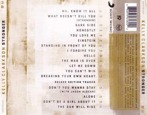
The back cover of Kelly Clarkson has a tatty and aged look to it, which could be a representation of everything that she's gone through in her past, what shes overcome and has now become a stronger person as a result. The tracks are listed in one long line, with the number ranking their order at the end of the name. The font on the back is black, which makes it easy to read and focus on the names of each song, and ensures they stand out. There is a lot of information on the back cover regarding the album label and lots of names clearly involved in the production. It is easy to see her record label is Sony Music as it is written in bold across the side with the logo next to it. The bar code and other logos and labels are on the top right hand side of the case. It is important to gather all these details because I will need to think about all these elements when creating my own ablum CD case.
Kelly Clarkson has clearly considered methods to increase her brand image with this album cover. This is shown with the photo matching the album name 'Stronger' and this therefore makes her an appropriate role model for the public eye. The fact that she seems to be promoting the idea of independence within women, and her body language in the image suggests she is secure in herself and in control of her own life. Furthermore, in terms of her mode of address, Kelly Clarkson has decided to approach her niche market as someone they can respect and look up to, which is vital for teenage girls in years of insecurity about their appearance. She manages to guide them through a mixture of emotions, which then makes her more relatable as an artist. This increases the demograhic, as she becomes more approachable by all audiences and creates a certain stability which they can aspire to have.
The image on the front cover of the album is a close up Kelly Clarkson's face in black and white with a chain wrapped round her hand and her hand slightly in her mouth. There are various factors inside this image which could be related to various theories such as Laura Mulvey and Andrew Goodwin's theory. Firstly, she seems to be wearing a strap or vest top and is therefore showing a lot of shoulder. This would lead to male viewers thinking she was wearing virtually nothing, and being more interested because it reminds them of sex. Secondly, the way she is nibbling on a golden chain could also be related to her being objectified. This attracts attention to her slightly parted lips and her biting the chain in a somewhat playful manner yet again reminds viewers of sex and would cause them to fantasize about Kelly Clarkson meaning that yet again, she is promoting herself as an artist. Furthermore, the image could relate to Andrew Goodwin's theory because her picture has an element of control and dominance over the audience which would match the album title 'stronger'. Also, a final point to comment on in terms of the portrayal of Kelly Clarkson in the image is her facial expression. Again, it seems she has considered the album name when posing for the photo, and she has
The lighting used on the image is relatively bright compared to other styles also in black and white. The theme is kept bright with the white back round with her hair being the only dark element of the picture. This could be a representation of her new strong character, and the idea that her future is bright with the new adapted persona.
The back cover of Kelly Clarkson has a tatty and aged look to it, which could be a representation of everything that she's gone through in her past, what shes overcome and has now become a stronger person as a result. The tracks are listed in one long line, with the number ranking their order at the end of the name. The font on the back is black, which makes it easy to read and focus on the names of each song, and ensures they stand out. There is a lot of information on the back cover regarding the album label and lots of names clearly involved in the production. It is easy to see her record label is Sony Music as it is written in bold across the side with the logo next to it. The bar code and other logos and labels are on the top right hand side of the case. It is important to gather all these details because I will need to think about all these elements when creating my own ablum CD case.
Kelly Clarkson has clearly considered methods to increase her brand image with this album cover. This is shown with the photo matching the album name 'Stronger' and this therefore makes her an appropriate role model for the public eye. The fact that she seems to be promoting the idea of independence within women, and her body language in the image suggests she is secure in herself and in control of her own life. Furthermore, in terms of her mode of address, Kelly Clarkson has decided to approach her niche market as someone they can respect and look up to, which is vital for teenage girls in years of insecurity about their appearance. She manages to guide them through a mixture of emotions, which then makes her more relatable as an artist. This increases the demograhic, as she becomes more approachable by all audiences and creates a certain stability which they can aspire to have.
